ENGINEERING A RESPONSIVE FLEET ORCHESTRATION INTERFACE
Bridging the gap between complex fleet data and intuitive user experience through adaptive UI architectures.
The problem worth engineering
Ujrah represents a shift in how fleet management systems are visualized. The challenge was to present high-density technical data (IoT sensors, TGA compliance, operational metrics) in an accessible, engaging format.
I engineered a 'Dual-Mode Layout Engine' where complex visualizations like the 'Smart Solutions Circle' use trigonometric positioning on desktop but transform into touch-optimized grids on mobile. The Hero section features a custom 'connector' animation engine that physically draws lines from the central infrastructure to feature cards, visualizing the platform's connectivity.
Performance was critical; I implemented device-aware animation timings (reducing delays by 60% on mobile) to ensure a snappy feel on lower-end devices while preserving the cinematic entrance effects on desktop.
- Engineered a 'Trigonometric Radial Layout' system: For the Smart Solutions section, I avoided static positioning. Instead, I built a dynamic layout engine that calculates `x = 50 + radius * Math.cos(rad)` and `y`. This allows the ecosystem of 8+ hardware sensors to orbit a central hub perfectly. The system auto-adjusts the `radius` (180px vs 260px) based on viewport analysis.
- Implemented 'Device-Aware Motion Choreography': In the Hero Section, standard animations felt too slow on mobile. I architected a conditional animation logic: `delay={isMobile ? index * 0.01 : 2 + index * 0.2}` and `duration: isMobile ? 0.2 : 0.5`. This creates a 'cinematic' 2-second staged reveal for desktop users while delivering an instant, high-performance load for mobile users.
- Developed a 'Responsive Interaction Model' for the Fleet Grid: The Fleet Management section uses a sophisticated 'Hover-to-Reveal' pattern on desktop, where hovering a smooth bento-grid card cross-fades the icon for detailed bullet points. On mobile, this logic is intercepted via CSS media queries (`hidden lg:block`), forcing a 'Always-Visible' state to ensure critical information is accessible without touch interactions.
How it was built, system by system
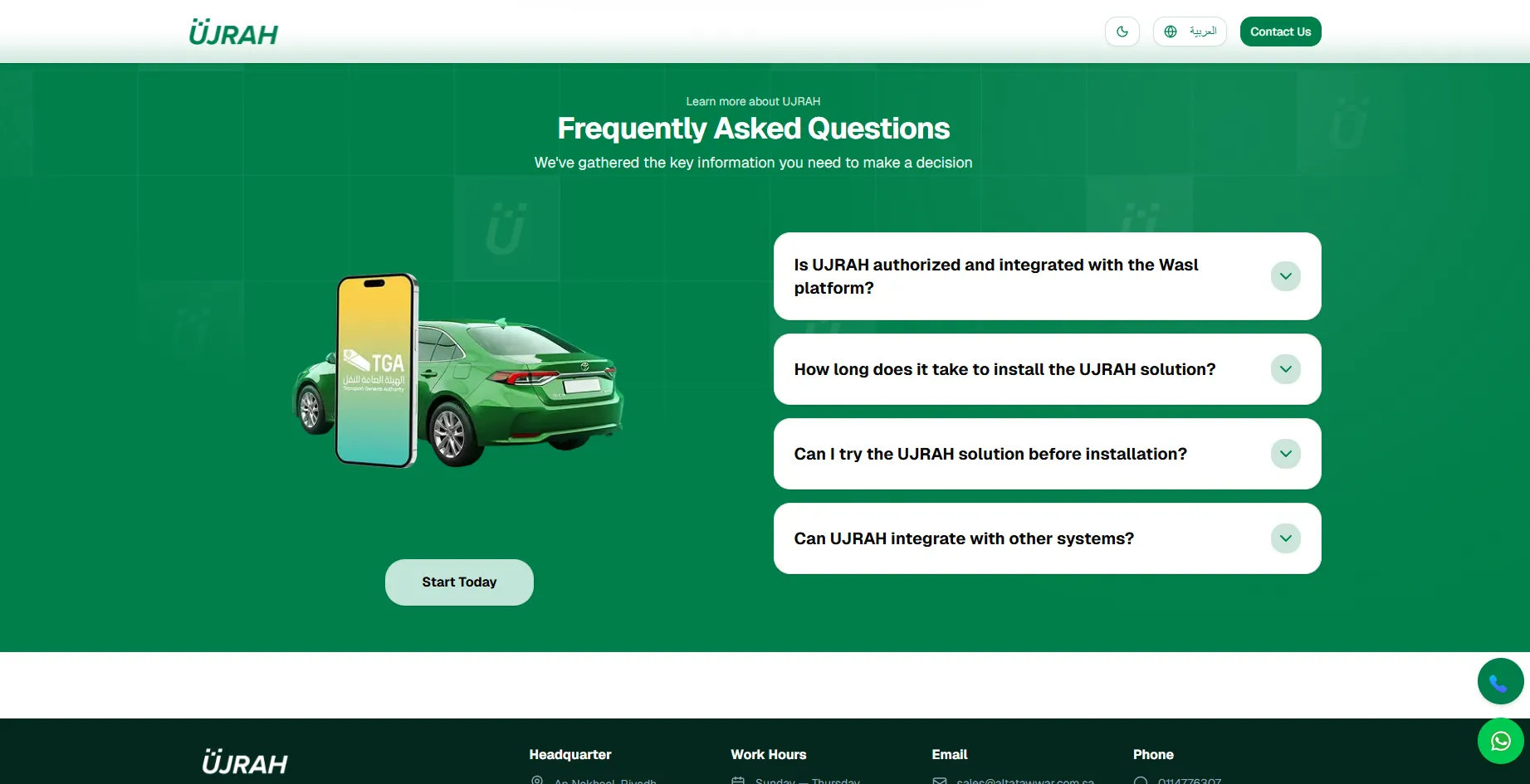
Interface documentation
Click any screen to inspect it full size.
Related Projects
Explore more of my work
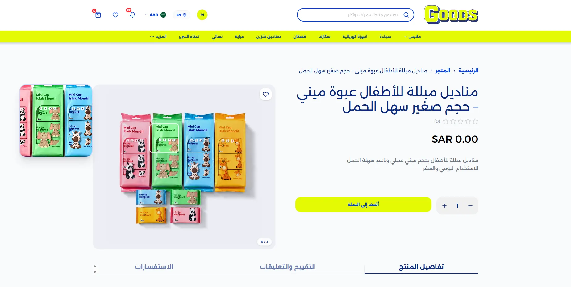
Goods&U | Full-Stack Bilingual (Arabic-RTL) E-Commerce Platform
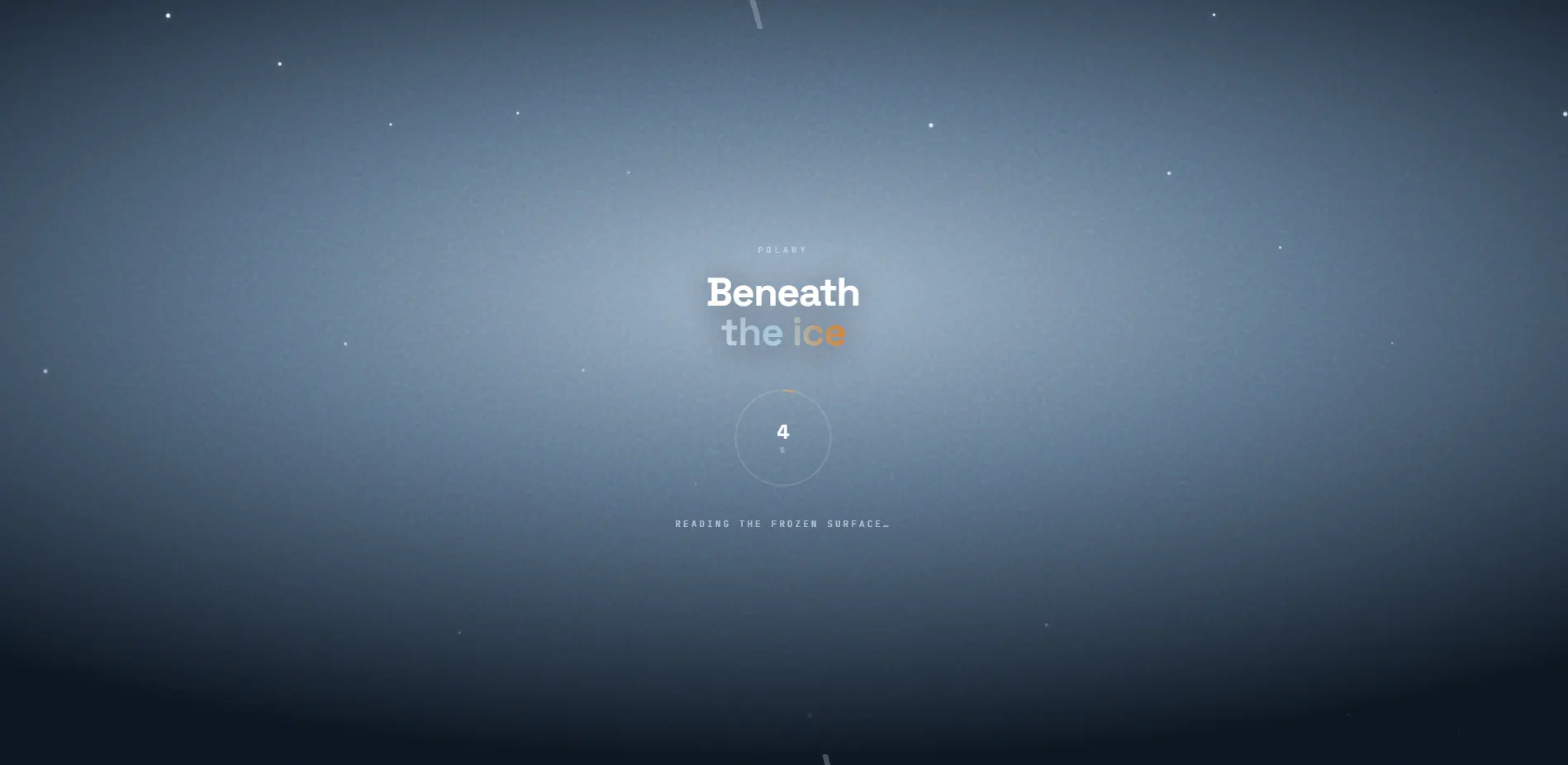
Polary | Cinematic 3D Narrative Landing Experience
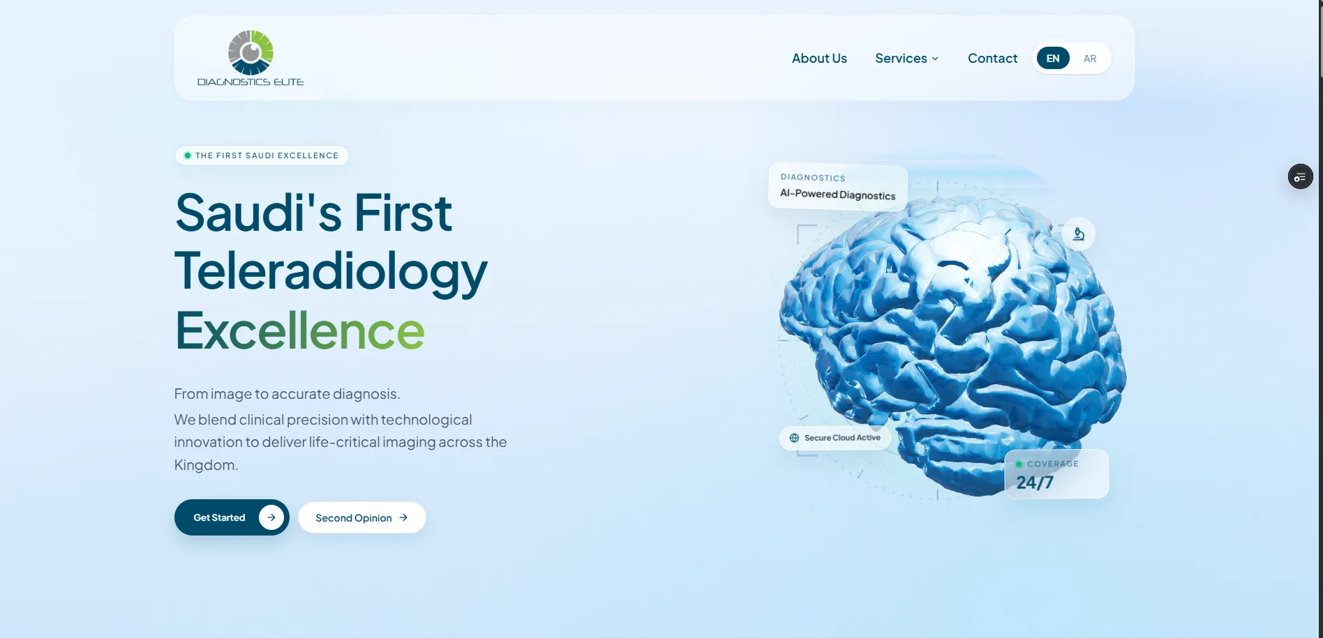
Diagnostics Elite | Cinematic Bilingual MedTech Platform (WebGL + Sanity)
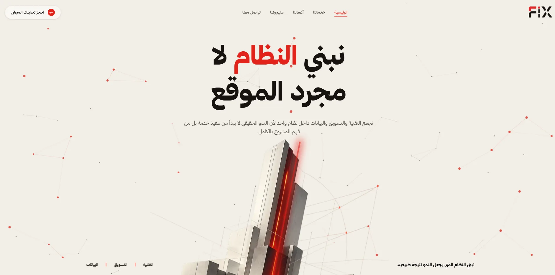
Fix Vision | Interactive High-Performance Creative Agency Platform
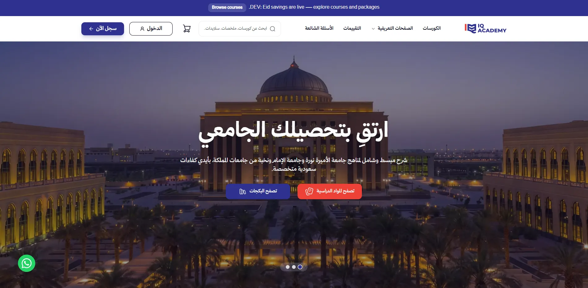
IQ Academy | Full-Stack Arabic EdTech Learning Platform
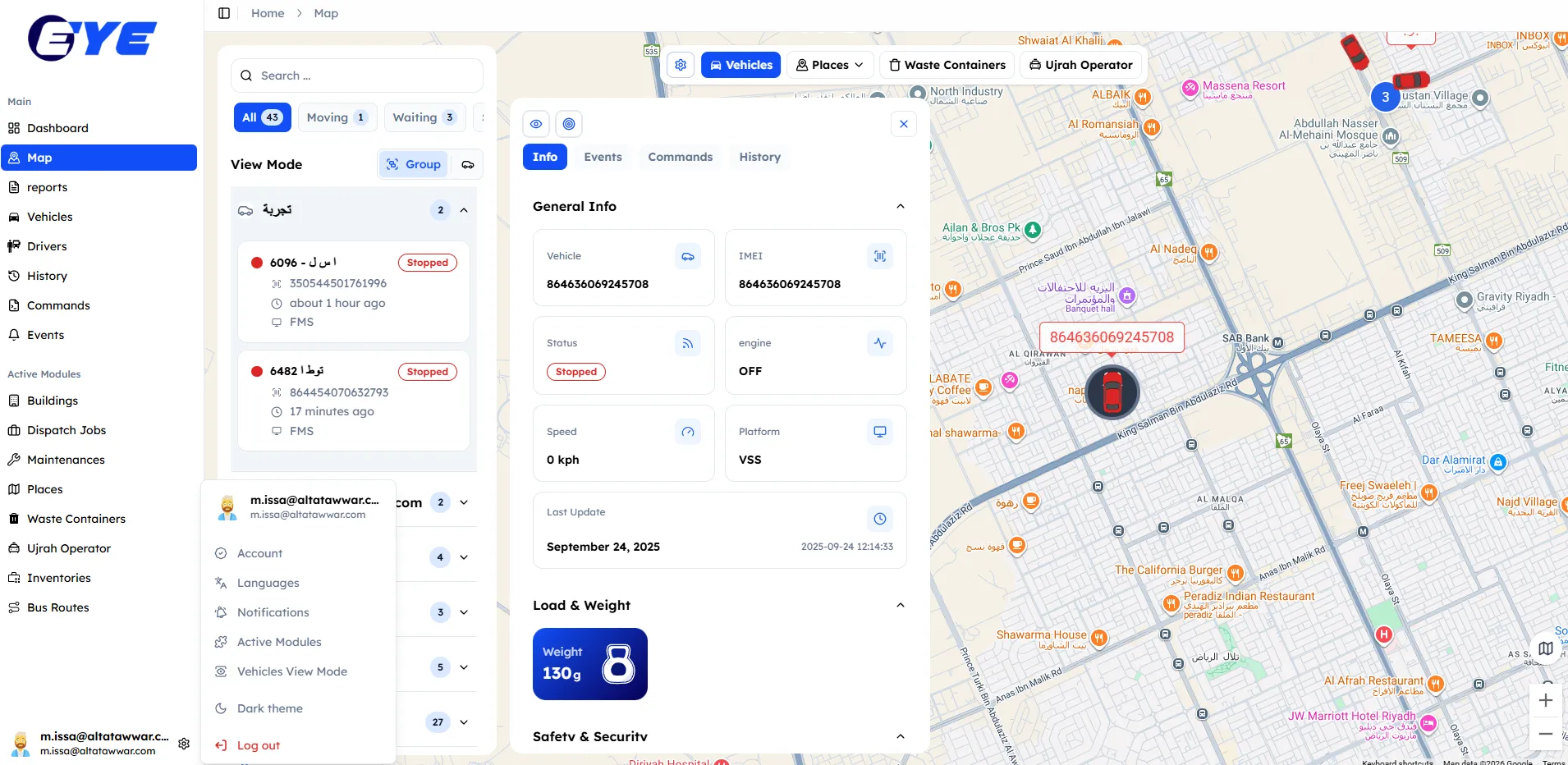
TMT Eye | Enterprise Intelligent Transport Operating System
Goods&U | Full-Stack Bilingual (Arabic-RTL) E-Commerce Platform
Polary | Cinematic 3D Narrative Landing Experience
Diagnostics Elite | Cinematic Bilingual MedTech Platform (WebGL + Sanity)
Fix Vision | Interactive High-Performance Creative Agency Platform
IQ Academy | Full-Stack Arabic EdTech Learning Platform